The true colour palette of nature
The beauty of the natural colours and colour moods is fascinating. But the reproduction of colours on different media often leads to spectacular but false results. It’s so easy to move the colour or contrast slider in Photoshop and increase the drama. Most of the photos on the Internet are “optimised” in this form of colour. They lie.
On the other hand, you won’t get colour-true results if photos remain unedited. The reason is the infinite adaptability of the human eye to the particular lighting conditions. The eye can perceive more extensive ranges of contrast than paper or screens can. So every photo already changes reality, because usually the full contrast range cannot be recorded.
The camera’s electronics are not sensitive to the emotional values of colours and scenes. In automatic mode, it tries to optimise the scene to an average level of contrast. Therefore this setting is (almost) always unusable for me. Other configurations are always an approximation. The photographer must decide what is more important: the full range of light or dark hues, a large depth of field or focus on detail, the visualisation of movement through blur or the freezing of a tiny moment. The photographer’s task is to transport the visual impression and emotional value of an environment with the photo. The finished image is always seen under different lighting conditions than those that set the tone during the shot. So I have to reproduce the soft beige and gold tones of a late afternoon in the Kazakh steppe with very low contrasts so that they don’t appear cloudy in the artificial light of an exhibition. In that case, I had to enhance the contrast.
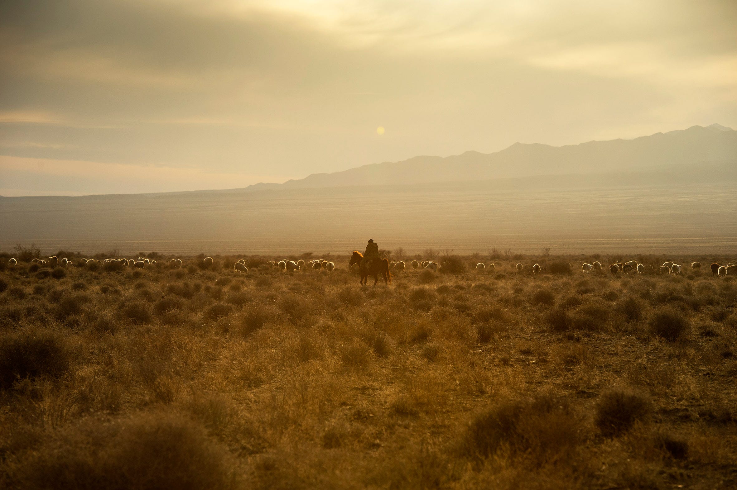
If one is in the landscape, the eye adapts to the light conditions. The light was soft in perception, with many subtle, gradual transitions, but by no means flat. Of course, the camera only registers the relatively low contrast range. The seemingly faithful reproduction would, therefore, be wrong again. It would not correspond to the experience of the viewer who was on the way in the steppe in the late afternoon and whose eyes had long since adapted to the dark lighting mood.
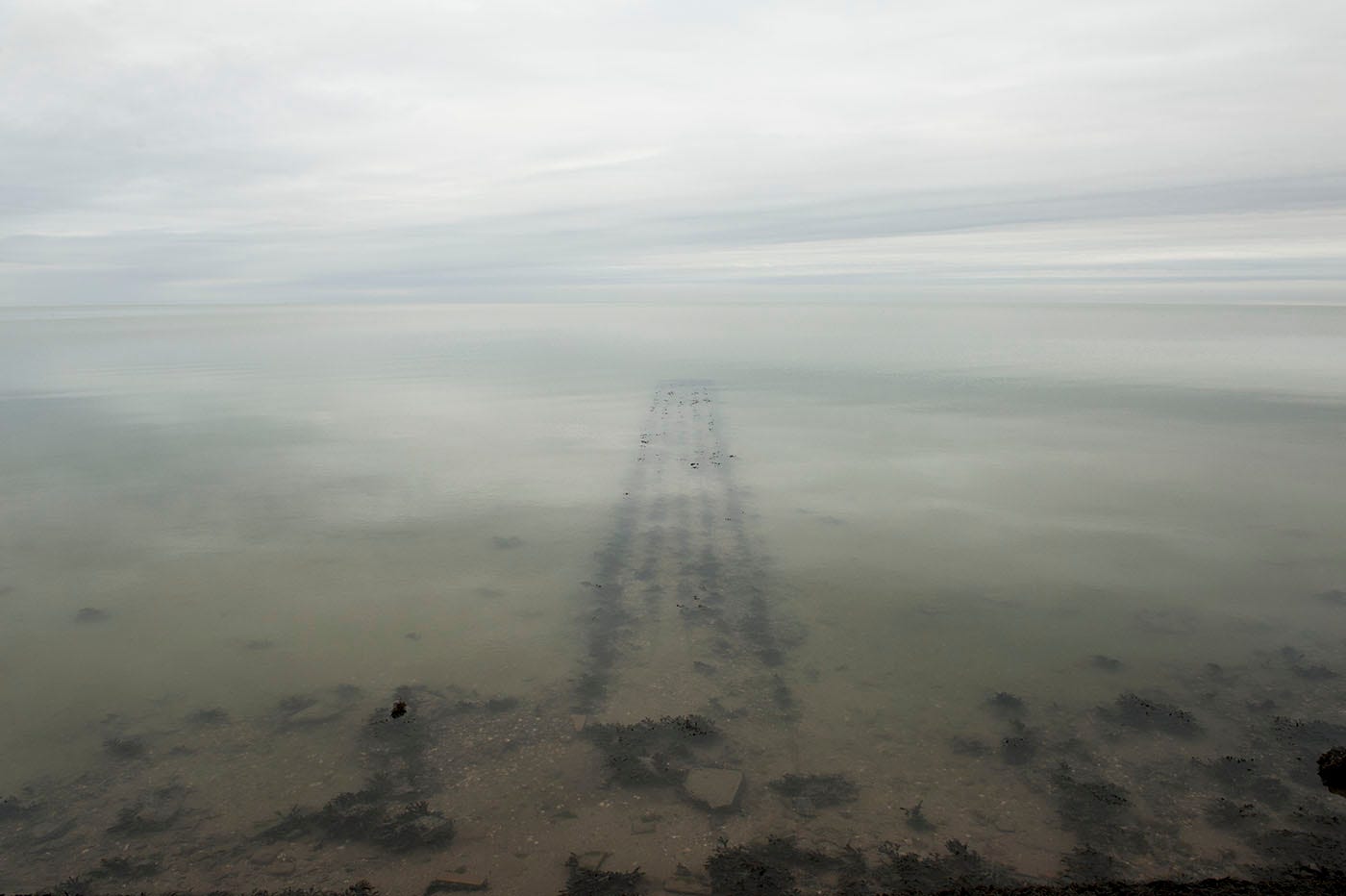
Clichés are the photographer’s enemy. The sea in Sardinia is azure blue, the sky bright. This is often the case. And if not, then there is Photoshop. There is nothing that cannot be “optimised” in Photoshop. If the beach wasn’t as lonely as the tourist dreams, then you remove the other bathers. But what does the result say? At best, it’s a perfect illusion. The colour palette is reduced to postcard level. But nature is much more fascinating. Only the “true” colours are beautiful.
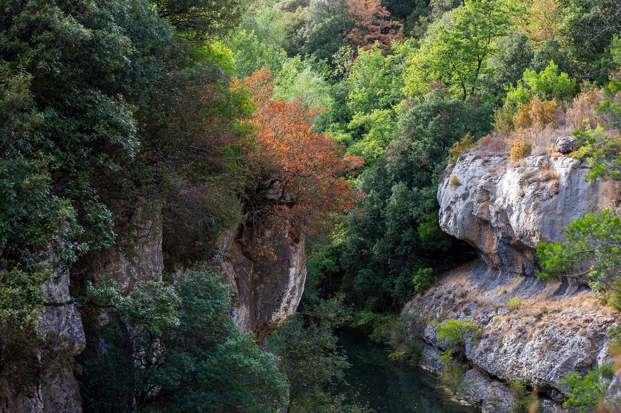
South of France, near Bugarach
But there is no objectivity in photography. No technique can reproduce a three-dimensional scenario “correctly” in two dimensions on paper or screen. Either the technology intervenes with its laws or the human being. The goal should be an honest photo. But it can only reflect the photographer’s subjective experience and perspective.
More pictures on this topic can be found on my website in the gallery under “The true colour palette of nature”.